
Portfolio | Bluesky | OtterTune | Triple Point | Topix
Bluesky
Title: Founding Designer
Cloud Data: Bluesky provides data-driven organizations with intelligent workload optimization and cost governance tools that help them innovate while keeping costs under control. I worked closely with product management, engineering and customers to gather the information needed to designing wireframes and prototypes for
Design Results: Improved workflows achieved reduction in Snowflake-related costs for users within the first three months of implementation. Depending on account size, savings could top $100,000 & more.
Recommendation from a Senior Executive at BlueSky Data:
“… a remarkable ability to synthesize diverse viewpoints and preferences into universally embraced designs ... Daniel's commitment to user research, paired with his collaborative mindset, makes him an indispensable asset to any team.”
Dashboards
An evolution of the various dashboards I designed for the application, starting with the previously existing dashboard I started to work with. All features required close collaboration with both product management and engineering.
* Note: left side navigation may differ from screen to screen, as that too evolved over time and is out of scope of this presentation.
* Important: Click on image to enlarge.
* Videos: Clicking on some of the images below opens up a related video illustrating its function.
Related videos of Figma prototypes: Warehouse Dashboard Concept

Original home dashboard upon my start, focused primarily on spending only.

Home dashboard now included a breakdown of spending by categories.

Home dashboard: addition of efficiency index, highlighting under or over utilization data warehouse settings. Update to top meta data panel.

Warehouse Dashboard: home not only dashboard in the application. Each individual area of the app (e.g. warehouses, queries, storage, etc) had their own dashboard. CLICK IMAGE TO VIEW FIGMA PROTOTYPE

Warehouse Dashboard

Warehouse Dashboard
Data Warehouses
One of Bluesky’s most important features was its data warehouse tools. One key feature was its Warehouse Analysis tool, which allowed users to compare up to four different warehouses to determine levels of utilization. Results might lead to decisions to merge or remove various warehouses to reduce overall spend.
Related videos of Figma prototypes: Warehouse Analyzer Tool

First take on data warehouse analysis comparison tool, informing a user on combined utilization in order to perhaps merge into single warehouses to reduce spending.

Follow up design concept, highlighting stacked charts representing different warehouses. Still at a point where only two warehouses could be compared. Would soon increase to four.

Warehouse Analyzer Tool: Final and signed off design concept built by engineering. User could zoom in from a month overview down to a 12 hour overview to a 15 minute overview of data performance in a data warehouse. CLICK IMAGE ABOVE FOR FIGMA PROTOTYPE
Miscellaneous
Variety of features I designed site-wide, working closely alongside product and engineering.
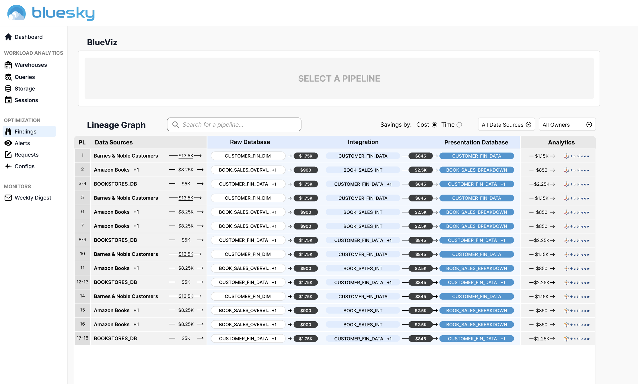
Lineage visualization tool, illustrating data pipeline data pipeline path. Breaks down costs, database processing and end points.

Clicking on a pipeline highlights ingestion and integration costs as well as ownership and spend limit warnings.

Complete redesign of content filtering.

Redesign of system and report emails.

Revamp of Findings page, which highlights recommendations that will lead to increased savings. Highlights low-hanging fruit and longer term fixes that includes risk factors.

Clicking an individual finding opens up a panel with full context as well as SQL code to make the change if the user doesn't allow Bluesky to do it for them

Alerts highlighting spending spikes, both over short and long-term time period.

Designed commenting feature to allow feedback between team members and departments.
Portfolio | Bluesky | OtterTune | Triple Point | Topix